
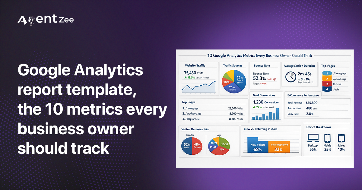
Google Analytics report template, the 10 metrics every business owner should track
The problem is not in the template structure, but in the data you intend to generate a report from. This blog suggests you use the top 10 metrics that clearly explain your website performance and from that you can get where the optimization needs to be done. This will help to grow your business.
Most businesses generate Google Analytics report templates that are filled with just numbers - but empty of valuable directions. Founders may see traffic from which users came to their site, and marketers may see the sessions their website received. After creating a report with all the metrics they can see in the GA4 dashboard, they end up with the big question: What should we do next with all these metrics🤷♀️️?
From this blog, you can get a clear vision of metrics and how they enhance your report templates’ value, and you will get an idea from which you can focus for growth.
Top 10 metrics for Google Analytics Report Template
The best report should not just give numeric data - it should give business decisions.
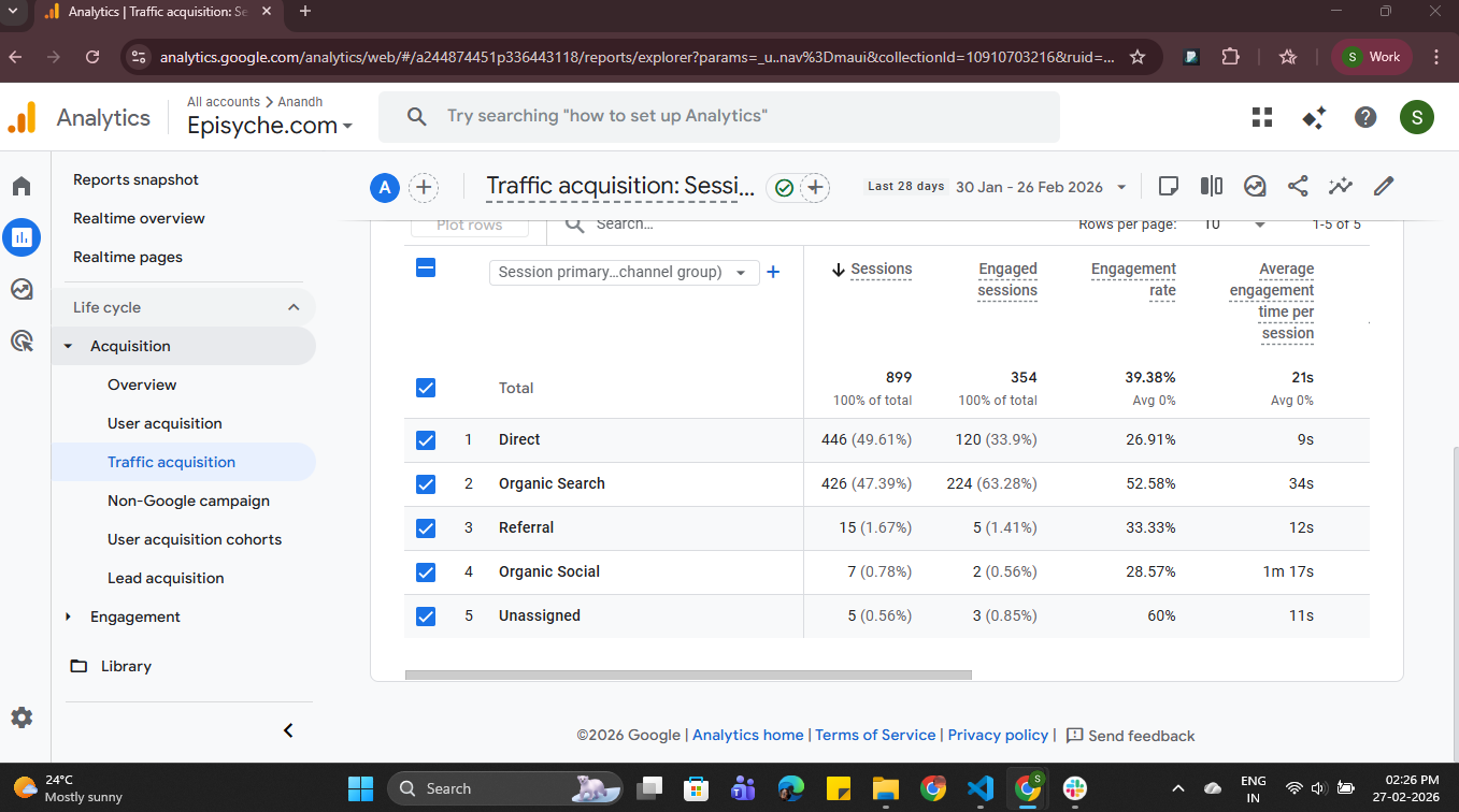
Traffic (Traffic acquisition sources)
Conversion Rate
Revenue
Engaged Sessions
Average Engagement Time per Session
New users vs. Returning users
Funnel Drop-off
User Retention (Cohort Analysis)
Average Revenue Per User
Landing Page Performance
To get the above metrics data through the API, you need some prerequisites:
To access the Google Analytics API you need to generate an access token - refer to our blog for getting these How to access Google Analytics dashboard data via API with an access token.
If you can’t see any metrics in your Google Analytics dashboard then you can add them manually:
If any metric or dimension is not present in the report page you are looking for, then add it in the customise report section. Refer to the blog to know how to add customised cards and metrics GA4 reports data and metrics are explained in a detailed manner, with how to customize the reports.
From this blog, you get template types provided by the Google Analytics Dashboard. Here, we used the ‘User Behaviour Template’.
Here’s why these metrics play a big role in business revenue and growth:
By understanding these metrics, you can get a clear vision of the root cause that affects your business growth. So that it can be easily identified and solved. By creating a Google Analytics report template with these metrics you can clearly get detailed data.
1. Traffic (Traffic acquisition sources)
From where people come to your website
This is a question every business owner faces at the beginning. Just total users or new users are not enough. For business growth and revenue, you have to know where you get more customers. If you spend in the correct place, you will get a good customer base.
Revenue is important, but correct investment is more important. This will help you understand which channel brings more customers and which one is underperforming. So that you can allocate quality budget towards a channel with scalable performance.
Here’s why it matters: if 70% of your converting visitors just came from organic search, but you spend budget on paid social, then you found a growth curve in the Google Analytics report template.
You can get traffic data through the API Curl request:
curl -X POST "https://analyticsdata.googleapis.com/v1beta/properties/PROPERTY_ID:runReport" \
  -H "Authorization: Bearer ACCESS_TOKEN" \
  -H "Content-Type: application/json" \
  -d '{
    "dateRanges": [
      {
        "startDate": "7daysAgo",
        "endDate": "today"
      }
    ],
    "dimensions": [
      {
        "name": "sessionPrimaryChannelGroup"
      }
    ],
    "metrics": [
      {
        "name": "sessions"
      },
      {
        "name": "engagedSessions"
      },
      {
        "name": "engagementRate"
      },
    ]
  }'
Sample response:
{
    "dimensionHeaders": [
        {
            "name": "sessionPrimaryChannelGroup"
        }
    ],
    "metricHeaders": [
        {
            "name": "sessions",
            "type": "TYPE_INTEGER"
        },
        {
            "name": "engagedSessions",
            "type": "TYPE_INTEGER"
        },
        {
            "name": "engagementRate",
            "type": "TYPE_FLOAT"
        }
    ],
    "rows": [
        {
            "dimensionValues": [
                {
                    "value": "Direct"
                }
            ],
            "metricValues": [
                {
                    "value": "151"
                },
                {
                    "value": "38"
                },
                {
                    "value": "0.25165562913907286"
                }
            ]
        },],
    "rowCount": 4,
    "metadata": {
        "currencyCode": "INR",
        "timeZone": "Asia/Calcutta"
    },
    "kind": "analyticsData#runReport"
}
Where can you see traffic data in the Google Analytics dashboard?
Google Analytics Dashboard → Reports → Life Cycle → Acquisition → Traffic Acquisition
2. Conversion Rate
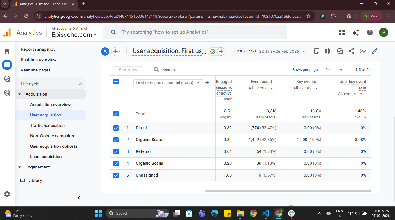
Traffic without a conversion rate is just an expensive contest. It is one of the most important performance indicators. In the GA4 dashboard, you can find this in “keyEvents.”
Conversion rate tells you how effectively your visitors turn into your customers or leads, like buying, signing up, booking a call, or whatever you want a customer to do on your website. Just 1% increase in conversion rate increases the total revenue💰 even in low traffic acquisition.
Even high conversion + low traffic = high revenue
You can get the conversion rate (key events) through the API Curl request:
curl -X POST "https://analyticsdata.googleapis.com/v1beta/properties/PROPERTY_ID:runReport" \
  -H "Authorization: Bearer ACCESS_TOKEN" \
  -H "Content-Type: application/json" \
  -d '{
    "dateRanges": [
      {
        "startDate": "7daysAgo",
        "endDate": "today"
      }
    ],
    "dimensions": [
      {
        "name": "sessionPrimaryChannelGroup"
      }
    ],
    "metrics": [
      {
        "name": "keyEvents"
      }
    ]
  }'
Sample response:
{
  "dimensionHeaders": [
    {
      "name": "sessionPrimaryChannelGroup"
    }
  ],
  "metricHeaders": [
    {
      "name": "keyEvents",
      "type": "TYPE_FLOAT"
    }
  ],
  "rows": [
    {
      "dimensionValues": [
        {
          "value": "Organic Search"
        }
      ],
      "metricValues": [
        {
          "value": "125"
        }
      ]
    },
      {
      "dimensionValues": [
        {
          "value": "Social"
        }
      ],
      "metricValues": [
        {
          "value": "32"
        }
      ]
    },
  "totals": [
    {
      "metricValues": [
        {
          "value": "300"
        }
      ]
    }
  ],
  "rowCount": 5,
  "metadata": {
    "currencyCode": "INR",
    "timeZone": "Asia/Calcutta"
  },
  "kind": "analyticsData#runReport"
}
Here you can get the key events data:
Google Analytics Dashboard → Reports → Life Cycle → Acquisition → User Acquisition
3. Revenue
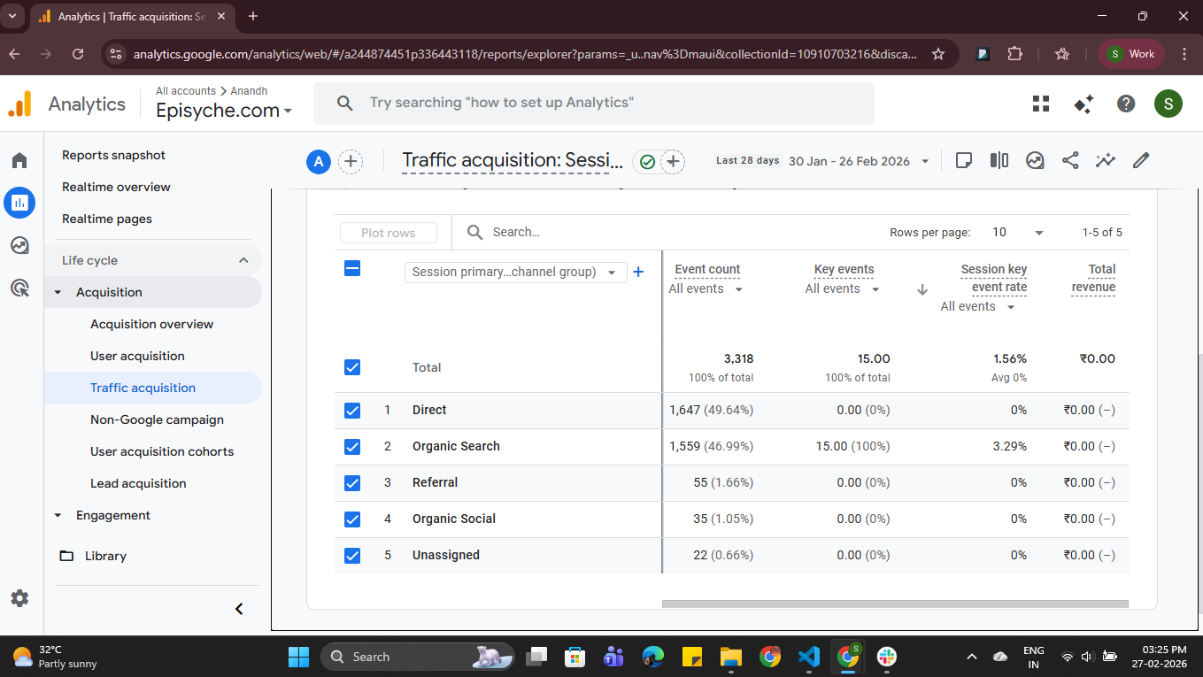
Revenue by channel is the honest mirror of your website
Traffic without revenue is just noise. Revenue holds the marketing efforts and strategies for business outcomes. If your business runs e-commerce or any other kind of conversion funnel, then revenue should be the icing on the cake.
But there is a part that more business people look forward to - Revenue by channel is where it gets interesting. If your this month's revenue is 50k, that’s good. Knowing 22k from organic search and 4k from paid search, you spend double on paid campaigns.
It tells you where to double down, double up, cut down, or where you’ve made mistakes. This metric helps founders or businesses to reallocate their spending with confidence.
You can get total revenue data through the API Curl request:
curl -X POST "https://analyticsdata.googleapis.com/v1beta/properties/PROPERTY_ID:runReport" \
  -H "Authorization: Bearer ACCESS_TOKEN" \
  -H "Content-Type: application/json" \
  -d '{
    "dateRanges": [
      {
        "startDate": "7daysAgo",
        "endDate": "today"
      }
    ],
    "metrics": [
      {
        "name": "totalRevenue"
      }
    ]
  }'
Sample response:
{
  "dimensionHeaders": [],
  "metricHeaders": [
    {
      "name": "totalRevenue",
      "type": "TYPE_CURRENCY"
    }
  ],
  "rows": [
    {
      "metricValues": [
        {
          "value": "15432.75"
        }
      ]
    }
  ],
  "totals": [
    {
      "metricValues": [
        {
          "value": "15432.75"
        }
      ]
    }
  ],
  "rowCount": 1,
  "metadata": {
    "currencyCode": "INR",
    "timeZone": "Asia/Calcutta"
  },
  "kind": "analyticsData#runReport"
}
Here you can see the total revenue metric for each traffic source
Google Analytics Dashboard → Reports → Life Cycle → Acquisition → Traffic Acquisition
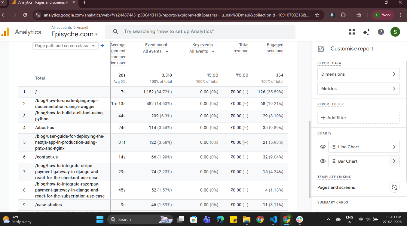
4. Engaged Sessions
Engaged sessions tell you whether the content of your website, landing pages, and user experience is actually resonating. If it’s low, 📉then your first impression is off, or if it’s high 📈, then people stay, explore, trusting.
This metric helps businesses to find more valuable visitors, optimize their website content, and measure their marketing ROI. You should focus on the content with highly engaged sessions and do more like them.
You can get engaged session data through the API Curl request:
curl -X POST "https://analyticsdata.googleapis.com/v1beta/properties/PROPERTY_ID:runReport" \
  -H "Authorization: Bearer ACCESS_TOKEN" \
  -H "Content-Type: application/json" \
  -d '{
    "dateRanges": [
      {
        "startDate": "7daysAgo",
        "endDate": "today"
      }
    ],
    "dimensions": [
      {
        "name": "pagePath"
      }
    ],
    "metrics": [
      {
        "name": "engagedSessions"
      }
    ]
  }'
Sample response:
{
    "dimensionHeaders": [
        {
            "name": "pagePath"
        }
    ],
    "metricHeaders": [
        {
            "name": "engagedSessions",
            "type": "TYPE_INTEGER"
        }
    ],
    "rows": [
        {
            "dimensionValues": [
                {
                    "value": "/"
                }
            ],
            "metricValues": [
                {
                    "value": "40"
                }
            ]
        },
        ...
        "rowCount": 43,
    "metadata": {
        "currencyCode": "INR",
        "timeZone": "Asia/Calcutta"
    },
    "kind": "analyticsData#runReport"
}
Here you can get the engaged session metric data:
Google Analytics Dashboard → Reports → Life Cycle → Engagement → Pages and Screens: Page Path and Screen Class
5. Average Engagement Time per Session
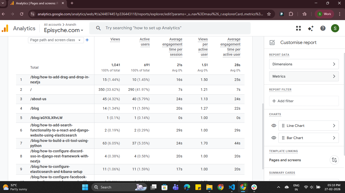
It ensures - Are people reading or just bouncing politely?
Average engagement time per session tells you how long people will stay on your website and read the content. It explicitly shows the real quality of the content we’ve shared. If a page has an average engagement time of 8 seconds, then it may have low-quality content or not have detailed content. If a page has 4 minutes, then it has quality content; you have to focus on that type of content.
To enlarge your business, you have to build trust in your content. The longer people engage with your content, the more your CTA automatically increases. This metric helps you to identify the quality of your content and optimization.
You can get average engagement time per session data through the API Curl request:
curl -X POST "https://analyticsdata.googleapis.com/v1beta/properties/PROPERTY_ID:runReport" \
  -H "Authorization: Bearer ACCESS_TOKEN" \
  -H "Content-Type: application/json" \
  -d '{
    "dateRanges": [
      {
        "startDate": "7daysAgo",
        "endDate": "today"
      }
    ],
    "dimensions": [
      {
        "name": "pagePath"
      }
    ],
    "metrics": [
      {
        "name": "averageSessionDuration"
      }
    ]
  }'
Sample response:
{
    "dimensionHeaders": [
        {
            "name": "pagePath"
        }
    ],
    "metricHeaders": [
        {
            "name": "averageSessionDuration",
            "type": "TYPE_SECONDS"
        }
    ],
    "rows": [
        {
            "dimensionValues": [
                {
                    "value": "/seo-checker"
                }
            ],
            "metricValues": [
                {
                    "value": "578.857594"
                }
            ]
        },....
        ,
    "rowCount": 84,
    "metadata": {
        "currencyCode": "INR",
        "timeZone": "Asia/Calcutta"
    },
    "kind": "analyticsData#runReport"
}
Here you can get the average engagement time per session data:
Google Analytics Dashboard → Reports → Life Cycle → Engagement → Landing Page
6. New Users vs Returning Users
Old is always gold 🥇
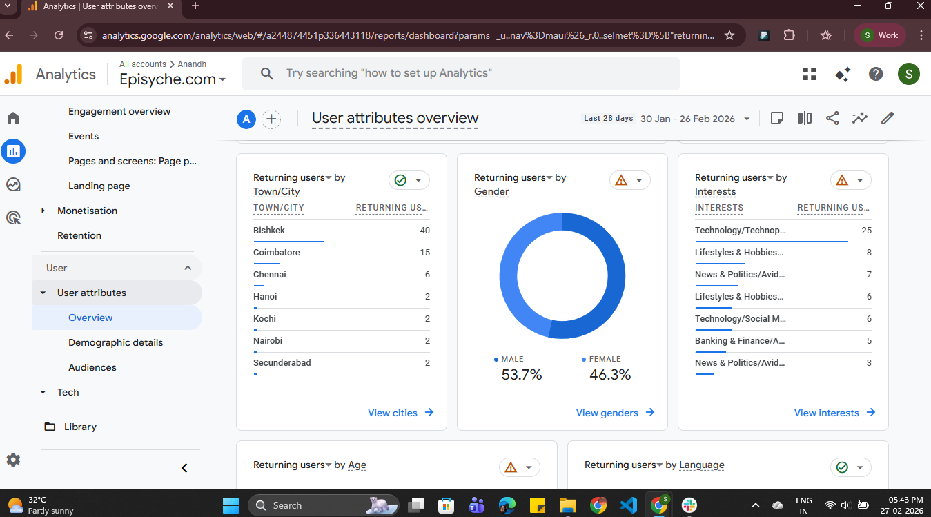
Businesses need to understand one thing that acquiring new users is important at the same time, but user retention is also important. This metric gives you the new users and returning users. Returning users means the user who came again after their first visit.
This strongly reveals whether your business depends entirely on new customers or lead acquisition or has strong retention. If returning users are low, then you have to focus more on marketing, ads, or quality content. In your Google Analytics report template, you can compare the new users and the returning users count, which will explain the detailed status of your business. In the Google Analytics report template this data will be explained in detail and compared.
You can get new users and returning users data through the API Curl request:
curl -X POST "https://analyticsdata.googleapis.com/v1beta/properties/PROPERTY_ID:runReport" \
  -H "Authorization: Bearer ACCESS_TOKEN" \
  -H "Content-Type: application/json" \
  -d '{
    "dateRanges": [
      {
        "startDate": "7daysAgo",
        "endDate": "today"
      }
    ],
    "dimensions": [
      {
        "name": "newVsReturning"
      }
    ],
    "metrics": [
      {
        "name": "activeUsers"
      }
    ]
  }'
Sample response:
{
    "dimensionHeaders": [
        {
            "name": "newVsReturning"
        }
    ],
    "metricHeaders": [
        {
            "name": "activeUsers",
            "type": "TYPE_INTEGER"
        }
    ],
    "rows": [
        {
            "dimensionValues": [
                {
                    "value": "new"
                }
            ],
            "metricValues": [
                {
                    "value": "170"
                }
            ]
        },
        {
            "dimensionValues": [
                {
                    "value": "returning"
                }
            ],
            "metricValues": [
                {
                    "value": "14"
                }
            ]
        }
    ],
    "rowCount": 2,
    "metadata": {
        "currencyCode": "INR",
        "timeZone": "Asia/Calcutta"
    },
    "kind": "analyticsData#runReport"
}
Here you can see new users’ and returning users’ data in the dashboard:
Google Analytics Dashboard → Reports → User → User attributes→ Overview
(or)
Google Analytics Dashboard → Reports → Life Cycle→ Retention
7. Funnel Drop-off
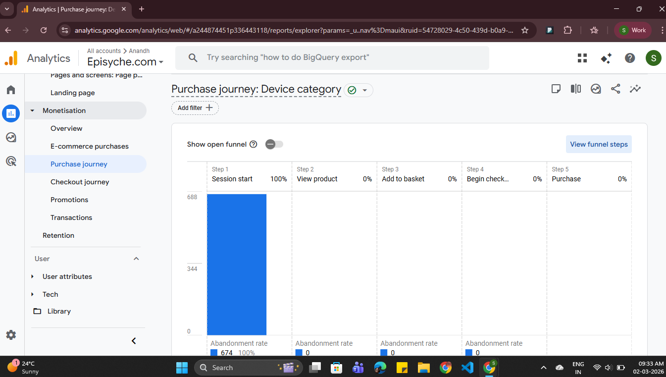
This data in the Google Analytics report template shows where customers abandon their purchase journey on our website. This metric leads to higher ROI, user retention, and user experience. Also, this provides transparency to your website, an actionable, and optimizable process. This analysis is very useful for businesses to visualize their customer journey, identify specific points of breakdown, and significantly increase the conversion rate. If you place this in your Google Analytics report template, then you can get a clear spot where you made a mistake, because some businesses might forget to focus on this.
If it drops by fixing checkout or form drop-offs, it can immediately improve revenue.
You can get funnel data through the API Curl request:
curl -X POST "https://analyticsdata.googleapis.com/v1beta/properties/PROPERTY_ID:runReport" \
  -H "Authorization: Bearer ACCESS_TOKEN" \
  -H "Content-Type: application/json" \
  -d '{
    "dateRanges": [{"startDate": "30daysAgo", "endDate": "today"}],
    "dimensions": [{"name": "eventName"}],
    "metrics": [
      {"name": "eventCount"},
      {"name": "totalRevenue"}
    ],
    "dimensionFilter": {
      "filter": {
        "fieldName": "eventName",
        "inListFilter": {
          "values": [
            "view_item",
            "add_to_cart",
            "begin_checkout",
            "purchase"
          ]
        }
      }
    }
  }'
Sample response:
{
  "dimensionHeaders": [
    {
      "name": "eventName"
    }
  ],
  "metricHeaders": [
    {
      "name": "eventCount",
      "type": "TYPE_INTEGER"
    },
    {
      "name": "totalRevenue",
      "type": "TYPE_CURRENCY"
    }
  ],
  "rows": [
    {
      "dimensionValues": [
        {
          "value": "view_item"
        }
      ],
      "metricValues": [
        {
          "value": "1250"
        },
        {
          "value": "0"
        }
      ]
    },
    {
      "dimensionValues": [
        {
          "value": "add_to_cart"
        }
      ],
      "metricValues": [
        {
          "value": "420"
        },
        {
          "value": "0"
        }
      ]
    }
  ],
  "totals": [
    {
      "metricValues": [
        {
          "value": "1975"
        },
        {
          "value": "28500.75"
        }
      ]
    }
  ],
  "rowCount": 4,
  "metadata": {
    "currencyCode": "INR",
    "timeZone": "Asia/Calcutta"
  }
}
Here you can get funnel drop-off data:
Google Analytics Dashboard → Reports → Life Cycle → Monetisation → Purchase Journey
8. User Retention Value (Cohort Analysis Performance)
From the cohort analysis, you can get the details of your customers, first visits, and how many times they come back to your site in subsequent days or weeks. This cohort chart is one of the most honest and important pictures of your business growth. A business with high acquisition and low retention is a treadmill. This metric plays one of the most important roles in your Google Analytics report template. To increase your revenue and to get a good place in the market, you have to focus on user acquisition and spend your budget on the correct channels.
High acquisition cost + Low retention = very difficult economics unit
You can get cohort data through the API Curl request:
curl -X POST "https://analyticsdata.googleapis.com/v1beta/properties/PROPERTY_ID:runReport" \
-H "Authorization: Bearer ACCESS_TOKEN" \
-H "Content-Type: application/json" \
-d '{
  "cohortSpec": {
    "cohorts": [
      {
        "name": "September_Cohort",
        "dimension": "firstSessionDate",
        "dateRange": {
          "startDate": "2025-09-01",
          "endDate": "2025-09-30"
        }
      }
    ],
    "cohortsRange": {
      "granularity": "DAILY",
      "endOffset": 30
    }
  },
  "dimensions": [
    {"name": "cohort"},
    {"name": "cohortNthDay"}
  ],
  "metrics": [
    {"name": "cohortActiveUsers"}
  ]
}'
Sample response:
{
    "dimensionHeaders": [
        {
            "name": "cohort"
        },
        {
            "name": "cohortNthDay"
        }
    ],
    "metricHeaders": [
        {
            "name": "cohortActiveUsers",
            "type": "TYPE_INTEGER"
        }
    ],
    "rows": [
        {
            "dimensionValues": [
                {
                    "value": "September_Cohort"
                },
                {
                    "value": "0000"
                }
            ],
            "metricValues": [
                {
                    "value": "770"
                }
            ]
        },....
         "rowCount": 23,
    "metadata": {
        "currencyCode": "INR",
        "timeZone": "Asia/Calcutta"
    },
    "kind": "analyticsData#runReport"
}
Note: The start and end dates will be in date format like ‘YYYY-MM-DD’.
You can get cohort data in another collection called ‘Business Objectives’
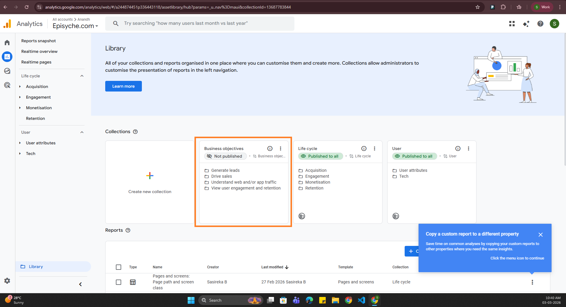
If you enable it, then you can get cohort data.
Google Analytics Dashboard → Reports → Business Objectives → Generate Leads → Generate Leads Overview
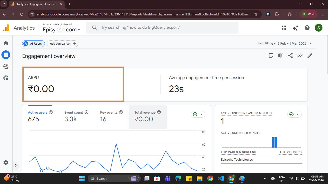
9. Average Revenue Per User
This ARPU means the average revenue of a business is generated from each user of the site. It helps analyze business health and overall customer value.
By analyzing ARPU across different traffic sources (like paid search, paid social, and organic search), you can easily identify which source your business gets more profit from. So that you can spend money on those channels.
You can get average revenue per user data through the API Curl request:
curl -X POST "https://analyticsdata.googleapis.com/v1beta/properties/PROPERTY_ID:runReport" \
  -H "Authorization: Bearer ACCESS_TOKEN" \
  -H "Content-Type: application/json" \
  -d '{
    "dateRanges": [
      {
        "startDate": "7daysAgo",
        "endDate": "today"
      }
    ],
    "metrics": [
      {
        "name": "averageRevenuePerUser"
      }
    ]
  }'
Sample response:
{
  "dimensionHeaders": [],
  "metricHeaders": [
    {
      "name": "averageRevenuePerUser",
      "type": "TYPE_CURRENCY"
    }
  ],
  "rows": [
    {
      "metricValues": [
        {
          "value": "125.50"
        }
      ]
    }
  ],
  "totals": [
    {
      "metricValues": [
        {
          "value": "125.50"
        }
      ]
    }
  ],
  "rowCount": 1,
  "metadata": {
    "currencyCode": "INR",
    "timeZone": "Asia/Calcutta"
  },
  "kind": "analyticsData#runReport"
}
Here you can get the average revenue per user data:
Google Analytics Dashboard → Reports → Life Cycle → Engagement → Engagement Overview
10. Landing Page Performance
Not all pages are created with equal value
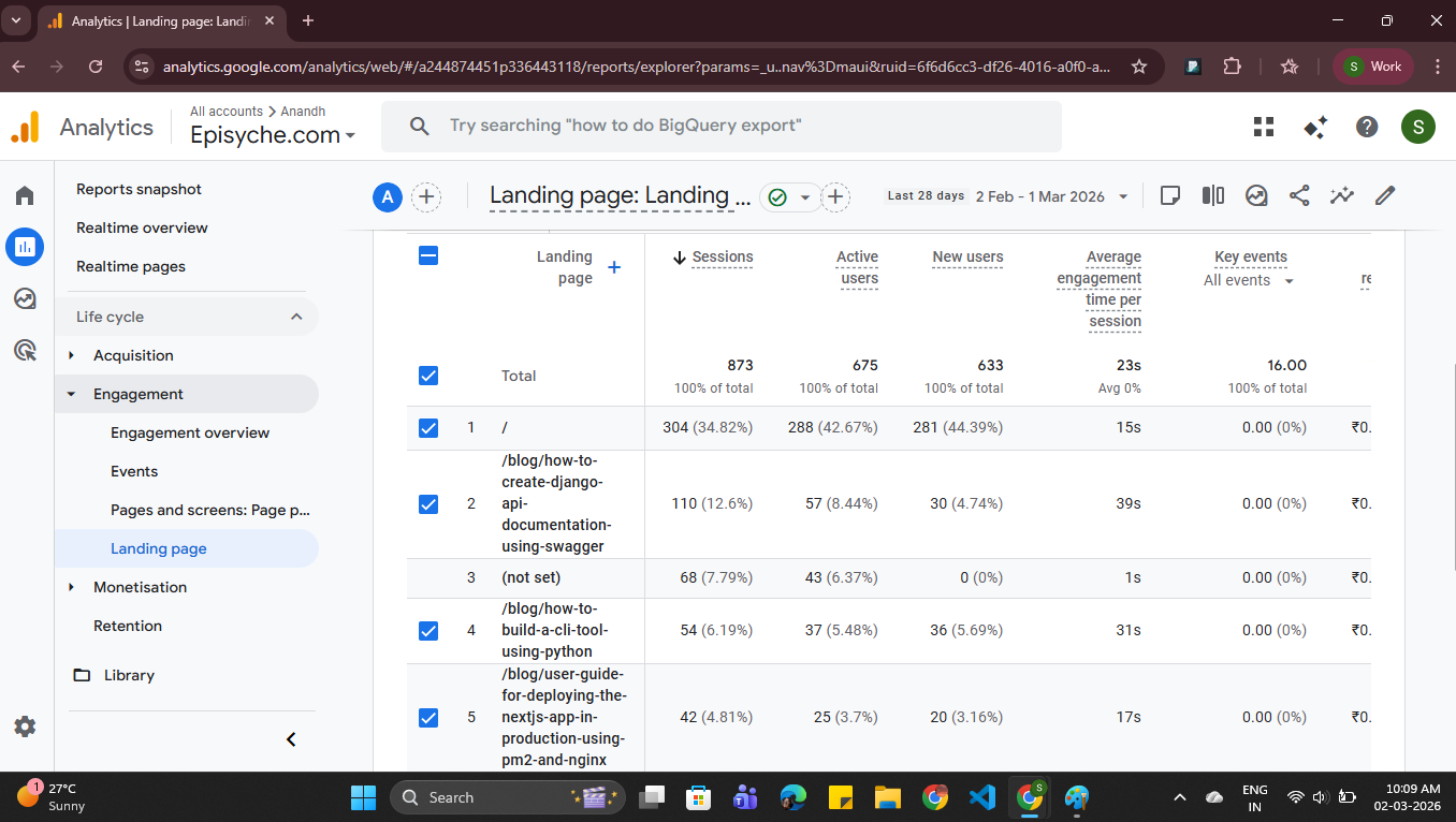
Your website’s landing pages are your digital sales team. By this metric, you can get the values of session, active users count, new users count, average engagement time per session, and key events of all pages in your Google Analytics report template. This analysis will tell you the performance of all landing pages on your site. From this, you can identify the most viewed page with high sessions and optimize the other pages' content according to that.
You can get landing page data through the API Curl request:
curl -X POST "https://analyticsdata.googleapis.com/v1beta/properties/PROPERTY_ID:runReport" \
  -H "Authorization: Bearer ACCESS_TOKEN" \
  -H "Content-Type: application/json" \
  -d '{
    "dateRanges": [
      {
        "startDate": "7daysAgo",
        "endDate": "today"
      }
    ],
    "dimensions": [
      {
        "name": "landingPage"
      }
    ],
    "metrics": [
      {
        "name": "activeUsers"
      },
      {
        "name": "sessions"
      },
      {
        "name": "newUsers"
      },
    ]
  }'
Sample response:
{
    "dimensionHeaders": [
        {
            "name": "landingPage"
        }
    ],
    "metricHeaders": [
        {
            "name": "activeUsers",
            "type": "TYPE_INTEGER"
        },
        {
            "name": "sessions",
            "type": "TYPE_INTEGER"
        },
        {
            "name": "newUsers",
            "type": "TYPE_INTEGER"
        }
    ],
    "rows": [
        {
            "dimensionValues": [
                {
                    "value": "/"
                }
            ],
            "metricValues": [
                {
                    "value": "97"
                },
                {
                    "value": "100"
                },
                {
                    "value": "93"
                }
            ]
        },.....
        ,
    "rowCount": 67,
    "metadata": {
        "currencyCode": "INR",
        "timeZone": "Asia/Calcutta"
    },
    "kind": "analyticsData#runReport"
}
Here you can get the landing page performance data:
Google Analytics Dashboard → Reports → Life Cycle → Engagement → Landing Page
Let’s see how to generate a Google Analytics report template using the metric we learned above.
Generating a daily or weekly Google Analytics report template involves technical steps. The above-mentioned metrics are the top metrics that will enhance your report template value, and you can identify the issues that affect your growth. By generating a report in UI, you can send it via email, or any other messaging app, or view it in a browser. Just by seeing raw data, it will be very clear and understandable.
Sample report will look like:
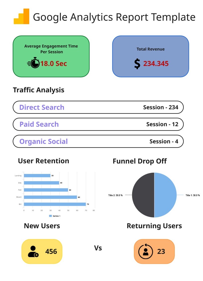
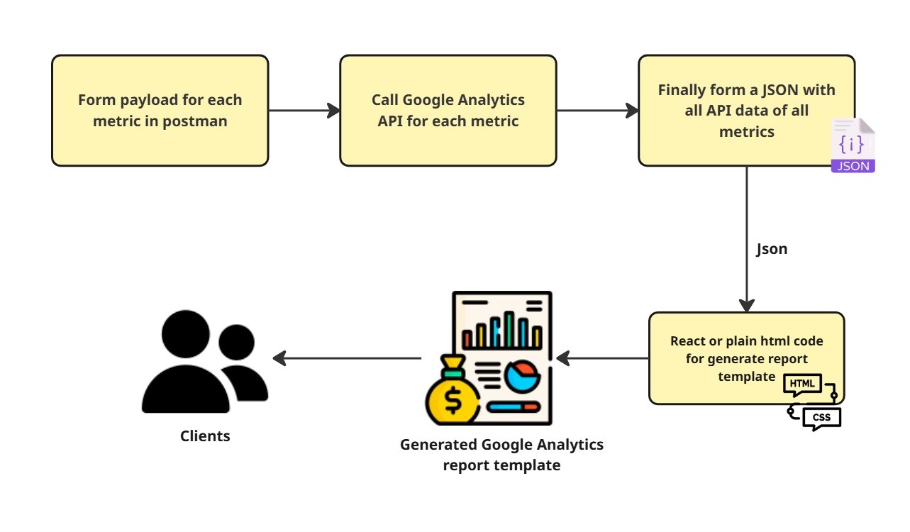
At first, you have to form a payload for each metric, then get the API response for all metrics. Form a single JSON with the retrieved data to generate a template. For this, use plain HTML or React.js to generate a UI report template for the single data JSON.
After generating the Google Analytics report template, you can send it to your clients, your organisation's users, or use it for your daily business performance analysis.
From this flow, you will get a complete Google Analytics report template through the API for the date range you want (daily or weekly)
Conclusion
This Google Analytics report template makes your work flawless and effortless. The Google Analytics dashboard has a massive amount of data, so we might miss some important data for our business problems. But to tackle this problem, if you generate a report with the metrics a business needs will help you to analyze and optimize the issues faster. These reports are the decision-maker that helps business people to understand their site performance, a way of optimization, and a way to spend the budget in the correct way.
According to the business, these report templates are helpful to solve: which channel acquires more users? Where to spend the budget for acquiring new users? How to get the old users back? Where do the customers drop off in the conversion funnel? How valuable is our landing page contents are? Which channel delivers the best ROI?.
In the long run, A well-designed and professional report template with valuable metrics will enhance their business growth, giving ideal improvements and optimisations, reduce guesswork, and give overall performance analysis in just one page.
If you want to generate a professional Google Analytics report templates then take a tour of our product Agentzee (https://agentzee.ai). We have a number of pre-built templates that make your work more flexible. You can generate report templates for Google Ads, Meta Ads, and Google Search Console.
To experience the report creation, explore our product